1.30.2013

tile files: is dark grout here to stay?

As I mentioned yesterday, at last weekend's IDS I got the chance to check out a presentation by Tommy Smythe & Suzanne Dimma, two of my favourite faces in Canadian design. The talk was about solutions to common dilemmas (low ceilings, awkward nooks, no storage, etc), and was hilarious and whip smart from start to finish. 

Yet even though their main points were interesting, it was a casual remark on Tommy's part that caught my attention most. While talking about a particular tiny bathroom, he noted "oh and notice the dark grout. I think it's pretty obvious that look is here to stay".

{ 1 | 2}

I was surprised. Don't get me wrong, I love dark grout with white tiles. A lot. I adore the way that it emphasizes the pattern, the way it references French bistros of old, and the way it prevents grout from starting to look old and dingy/dirty because it's clear the colour is uniform and is supposed to look that way. 

But grout that matches the tile has been viewed as the way to go for a donkey's age, and this contrasting look only took the design world by storm recently. It has all the signs of being a trend (a sudden appearance in a million new spaces and being touted on every blog and in every magazine as being a look to love) so I'd always assumed it was one.

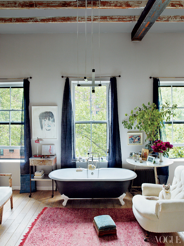
The fact that he was so matter of fact makes me wonder: was I completely off the mark? Is this look one of the magic few that will make the transition from fad to design staple? And if so, are we only talking the more subtle variations . . .

{via}

{via}

. . . or the slightly more pronounced as well?

{via}

{1 | 2}

What about the crazy dark and crazy thick? Will this kitchen be just as relevant in 20 years as it is now?

{via}

Or will design-lovers walking into this space be able to pinpoint the exact period that the homeowners took a trend - whose subtler version has stuck around - and just plain went with it.

I'll be so curious to see. I'm crossing my fingers that Tommy is right - are you?

post signature

1.29.2013

toronto interior design show: ids for success

Hey hey hey, hope you all had amazing weekends! Am I allowed to say that on a Tuesday? Does the fact that my work/city flooded yesterday excuse my lateness at all?

Gotta say, it was pretty crazypants, but the sour of that just re-emphasized the sweetness of the days leading up to it, which I spent trekking up to Toronto to visit with one of my absolute best buds - and to check out IDS for the first time. I came away from the latter with an iPhone full of pics, a mind full of musings, and some generally mixed feelings about the event as a whole. I came away from the former with a stomach full of macarons, mimosas and slow cooked meats . . .

I only have pics from previous years to go on, but this years IDS was a lot more trade/renovation heavy than I was expecting, with less of a focus on creativity/design. Maybe those pics were deceiving, but I was hoping for more concept spaces - a pimped out version of IKEA's "rooms within a store" maybe - and those were few and far between. There were a couple of gems to be had, though, the best being, hilariously, IKEA's. Here are a few of my fave pics from the day:


The IKEA designers thought outside the box by putting together more than 30 individual budget pendants to make something truly showstopping. They also did an amazing job of mixing in vintage pieces and natural textures to elevate their wares:


Other than the tub, everything in this room was IKEA, but this insane vintage piece instantly "haute'd" everything else...


As much as I adored that tub, the ceramic in this one might make it a bit more practical/comfy for those late night soaks:


This industrial booth may not be my usual style, but it was so obviously a labour of love that I couldn't help but appreciate:


These two fixtures were just plain perfection:


That second one, in particular, could come home with me right this second. It looks like it might be the same little scene stealer that Ballard just started selling.

The real highlight of the day? The dashing Tommy Smythe (designer extraordinaire) and lovely Suzanne Dimma (editor of my fave design mag), whose talk was as hilarious as it was insightful:


Or maybe it was the indoor Taco Truck. I can't decide.


Who am I kidding, I can clearly decide.

P.S. This guy came up on Montreal's SPCA (pet shelter) facebook page, and I just about died:


Look at that face!!

He was adopted in about 2.5 seconds, which is probably good because I was beyond tempted to get my ass down there and come home with a new bud for G. 

Anyone else ever have a weak moment where the downsides of two doggies in an apartment just fly out the window? Or actually have more than one munchkin and think it's no biggie? I'd love to hear your tales, cuz man, I'm not sure I'll be able to resist a mug like that again...

post signature

1.24.2013

tile files: hex aka honeycomb aka perfection

The other day I was going through my bathrooms folder on Pinterest when it hit me that a ridiculously high number of my recent pins are rocking hex tiles. Inordinately high actually. It kind of looks like I'm obsessing and I didn't even know I was doing it.

{via}

But really, when it comes right down to it, I kind of am obsessed. Because hex tiles (or honeycomb tiles, poh-tato, paw-tato) are both insanely classic - meaning they'll never go out of style - and insanely versatile - - meaning they can still make a big statement. That's a rare combo, and one that's put them pretty much at the top of my "will def use in a future reno" list, along with subway tiles from floor to mother f-in' ceiling.

The pattern possibilities for hex tiles are borderline endless . . . hell, you could even put your initials right into the floor! If you didn't care about resale that is. Add in size, colour and material options, and all you need to create some serious amazingness is a little imagination and whole lotta' grout.

{via}

{via}

{via}

{via}

{via}

{via}

{via}

{via}

{via}

{via}

{via}

{via}

{via}

{via}

Hex tiles aren't just for bathrooms, either. I also think they can look pretty bangin' in kitchens:

{via}

{via}

And even better in entries (especially with red doors):

{via}

{via}

Remember the whole "write your initials in it" thing? Well this is pretty damn close . . .

{via}

Except for someone who does care about resale.

If you didn't love hex before, I hope this avalanche of images has helped change that. If you just didn't really notice it before, then do a little experiment for me, would you? Take a look through your inspiration folder - bet you anything you've got a couple pics in there featuring these lovelies. Just hanging around. Classin' up the joint.

Found a few? I thought so :)

Now let's all join together and pray that someday, we'll see oh-so-many-more bathrooms using these classic beauties, and oh-so-much-less 12 by 12 beige travertine . . .

Amen.

post signature

1.22.2013

would you? rainbow painted floors . . .

A couple of weeks ago Danika of Gorgeous Shiny Things (who kicks ass by the way) posted about her future kitchen plans, and I fell absolutely in love with one of the images she included. Namely, this one:


Those. floors. I love painted floors even on their worst day - hell, both my entry and bathroom have them - but these rainbow beauties are beyond. The word effervescent comes to mind, doesn't it?! It feels like a bottle of sparkling rosé and a swishy polka dot dress all wrapped into one!

Kate Spade apparently did the same thing in one of her stores in Palm Springs:

{via}

Ms. Spade always knows what's up.

And this gorgeous booth from last year's Toronto Interior Design Show (IDS) is just the icing on the sherbet coloured cake:

{via}

Ah-mazing.

So what do you think? Love or hate it? If you love it like me, would you have the guts? Would your floors have to be in terrible shape before you'd pick up the brush? Mine are, so best believe I'd be on it already if I had any patience or painters tape luck to my name!

P.S. I can't WAIT for this year's IDS. I've been meaning to go for years, and I'm finally making it happen. So excited to see what gorgeousness they come up with, and to round it all off with a little Winterlicious. Gonna be indulging in goodies of all kinds!

post signature

1.21.2013

a country house in the city

Vogue.com just published pics of Miranda Brooks' home, and there is a big part of me that literally can't wrap my head around the idea that it's in Brooklyn. Honestly, I hear the words coming out of their mouths, but they just don't compute . . .

First of all, the bathroom. A little part of me died when I saw it.


The light, the space, the character, the books . . . I would never leave. I'd just keep picking a new novel and getting right back in the tub.

The office, kids rooms, rooftop potting shed and insane backyard are none too shabby either.


Yes that is a rabbit coop. In Brooklyn.

This type of life is literally my dream. All the perks without the commute or inaccessible sushi.

I'm going to take this as proof that you can have the best of both worlds. You just have to be a celebrity landscape designer/contributing editor of Vogue who's married to a hot architect. Easy enough right? I'll get right on that . . .

post signature