7.30.2012

an ode to pink and green

A couple of weeks ago Emily Henderson posted the before and after of her guest room makeover, and I was completely blown away.

To refresh (or just show if you haven't already seen it), here is the before:


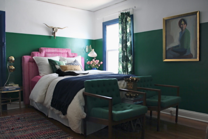
And here is a taste of the deliciously gutsy after:


I know it's not for everyone, but I think she f-ing killed it. I have serious talent envy. So, so ballsy and unexpected.

I think it goes without saying that the pink headboard makes me weak in the knees, but it's my love of the green that's more surprising. Not a colour I would have ever thought of using, and yet Emily's room started an ocd pinterest-a-thon that has left me with enough images to fill more blog posts than I'd like to say. 

For now, I've put together a little ode to emily's combo of choice: pink and green. From the super bold (emerald leather chairs anyone?) to the more subtle pops (like the lamps in this first pic), I'm in love with every one of these spaces:


Freaking. Fabulous. I mean, how amazing would this couch and pillow combo be against a dark emerald wall?


{discontinued wisteria sofa, pillows from here and here}

Stay tuned for more green goodness later in the week . . . 

post signature

7.26.2012

sarah seven spring: a rosy haze

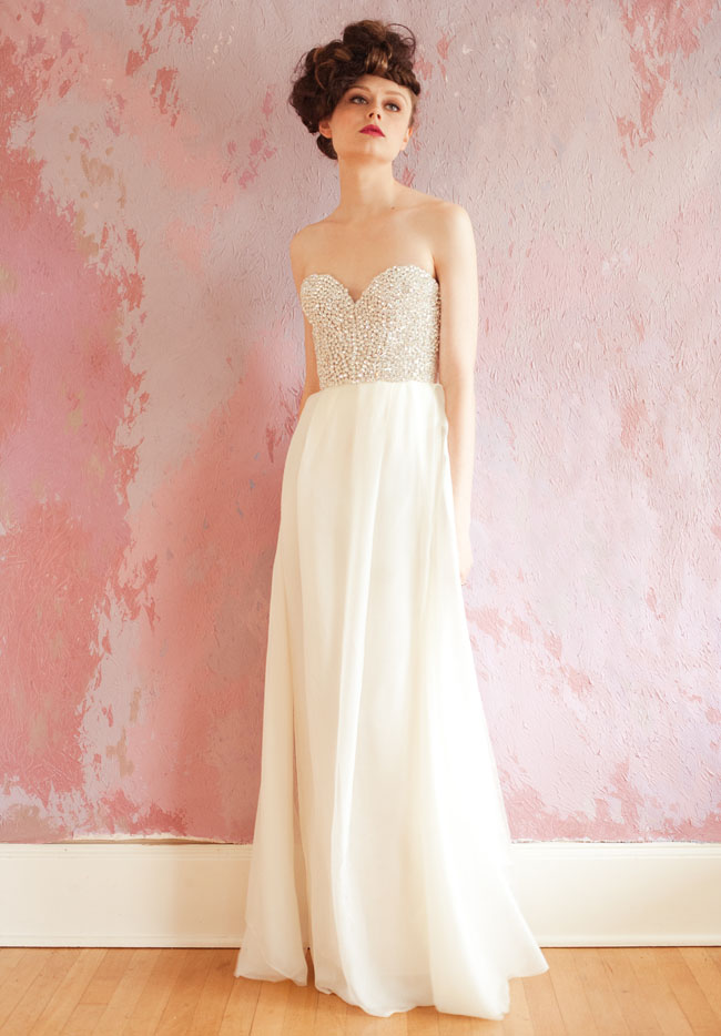
Yesterday I happened upon Sarah Seven's Spring 2013 collection, and fell deeply, madly in love. Not only because the dresses are exquisite (ethereal is truly the word), but because the paint treatment they used as a backdrop is giving me that I-want-this-so-badly-I-may-burst-into-tears feeling.

You have no idea the things that I would do with a room like this. My imagination is running wild.

Somehow I've managed to make this sound really dirty...


Oh. my. god. I want to rip the paper off the wall and wrap myself in it and hysterically scream at anyone who approaches to "get away from me!" or "don't touch me!"

I'm so normal.

To whoever conceived of/painted this: hats off. Seriously, hats off.  I better be seeing it interpreted in a design magazine soon or I'm going to wonder what the hell is wrong with designers with actual money to spend.

post signature

7.24.2012

plaid & gingham

The other day while looking for a rug I came across a weirdly fascinating ottoman. Fascinating because if you'd described it to me I probably would have thrown up in my mouth a little. It was boxy, slightly floppy, super squishy and plaid. 

See, there's that gag reflex.

But in reality I actually really loved it.


I really dig the quirky preppiness of it, and the fact that it's man-comfy while also being man-cool.

It reminds me of this room I posted a couple of weeks ago:


I think it could look really awesome in there, or in a room with a feel like these:


Ralph-lauren hunter chic or refined British frat house. Not my usual style, but looking at that second room above I know I would automatically have to sleep with the guy who lived there. Just out of principal.

It's not like this is the first time I've been attracted to moody and masculine spaces featuring plaid/gingham though. Here's are a couple of other rooms that use it oh-so-well:


By the way, the amazing Tommy Smythe had a hand in those last four rooms. Man loves himself some plaid, and I loves myself some Tommy.

(all other images via roost, coco cozy and pinterest)
post signature

7.18.2012

black and white and gorgeous all over

The beautiful apartment of Crystal Gentillelo (editor of Rue) was recently posted on Apartment Therapy, and while so much of it was amazing (the drop-dead light fixture in the kitchen and deliciously moody living room for starters), I was once again most drawn to the bathroom (or more precisely, the powder room).


It's undeniably so very pretty, but I think the main reason it spoke to me more than the rest of the apartment is that it's most striking feature - the black and white striped walls - are easily achievable regardless of budget. No fancy upholstered pieces or designer furniture needed, just a couple of gallons of paint and some very, very good quality painters tape. 

Truth be told, I have yet to meet a black and white striped bathroom I don't want to buy a BFF bracelet for. Here are just a few of my faves:

{via}

{via}

{via}

Know where else this look really works? In the entry. It makes for such a bold yet timeless first impression. And bold and timeline is a pretty rare combination.

{via}

{via}

{via}

Now not all black and white spaces are created equal. I've seen some real clunkers that might make you question if this is a good idea at all. But here's the thing: notice how in each of these rooms the walls are broken up by multiple pieces of framed art/mirrors/windows? Notice how each of the pieces of art contain a bit of black themselves? Notice that other homey elements usually reserved for living spaces (rugs, chandeliers, chairs, books) have been incorporated even in the bathrooms?

Them's the tickets folks. To make this work you have to break it up, giving the eye other places to rest and infusing the stark quality of the black on white with a little warmth and a "lived in" feel. 

I would also usually reserve this treatment for small spaces you only spend a limited amount of time in. In a larger space it could get to be a bit much (and maybe even borderline dizzying). Really, when it comes to black and white stripes, I think the smaller the room the better. I have come across a couple of exceptions, however, that pull it off really well and remind me that no rules are universal:

{unknown}

{via}

{via}

{via}

My favourite of these? You got it, it's the last two. The warm tones of the wood and gold frames are the keys to their success, making them feel cozy rather than jarring or cold.

Well those and the red velvet sofa. That room had me at red velvet sofa.

In most cases though, I stick to my guns. Rooms like this one in Lonnythis one in Elle, and this one by Robert Pascal are beautiful, but I feel like they would become overwhelming pretty fast. That's just me, however, and I know there are those who would strongly disagree!

A whole other debate? Whether or not you prefer your stripes vertical or horizontal. I know where I stand. Do you?

post signature

7.16.2012

i heart your art: francois de felice

Once again, Pinterest has brought me a jewel. I think that Francois de Felice's artwork is some of the most exquisite that I have seen in a long, long time. 


It's all so incredibly interesting, layered and lush. Beautiful and yet somehow also deliciously morbid and creepy. Like a science experiment on a peacock. 


As I was going through the images I kept picturing rooms built around each piece, so just because I couldn't resist, here's a little design based on "La chambre du miroir". It's hard not to be inspired by this kind of beauty and creativity, isn't it?

(Note to self: if you're just learning how to remove backgrounds from images don't start with the most finicky coffee table and sconces ever. Especially not at 2am. Oh. Lord.)

post signature